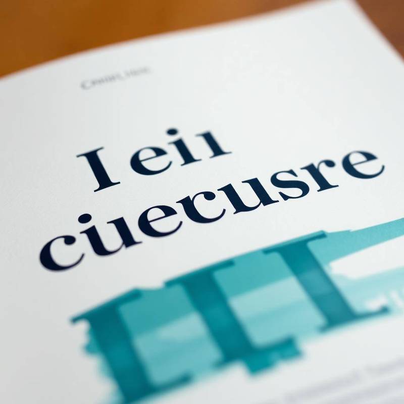
A typeface is a voice, and 'neutral' is a voice too — usually the one that says nothing memorable. We pick type the way a director casts a role: for character first, versatility second.
The four tests we run before we commit
- Does it hold a full-bleed headline without shouting?
- Does it survive 12pt on a tired reader's phone?
- Does it pair with a working companion for long-form?
- Does it license cleanly across web, print, video and product?
Custom vs curated
A custom typeface is a serious commitment — three quarters of work and a licensing model to maintain. A carefully curated pairing from a good foundry is often the smarter answer for 90% of brands, if it's chosen with intent instead of by muscle memory.
"The wrong typeface is the fastest way to say something you didn't mean."